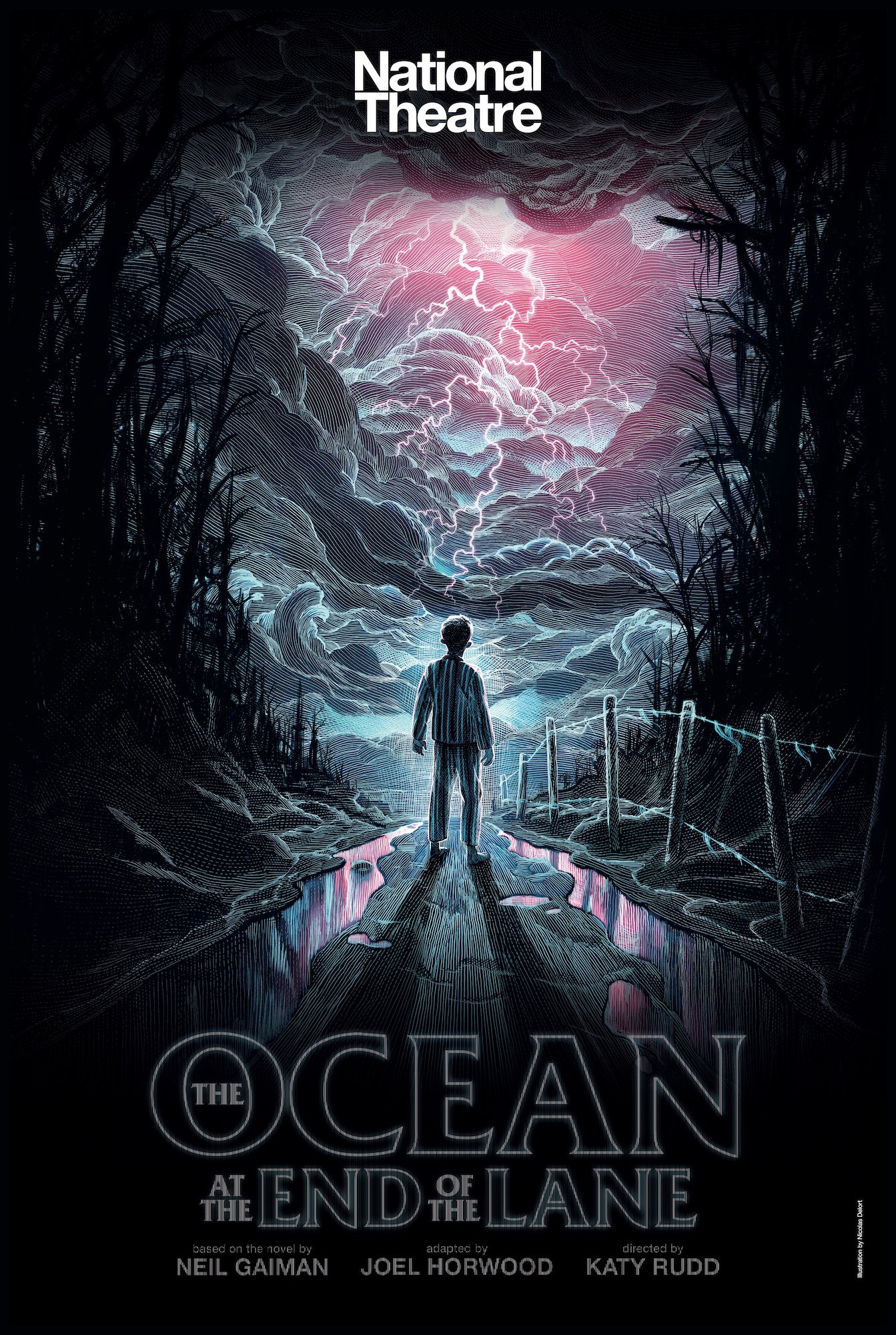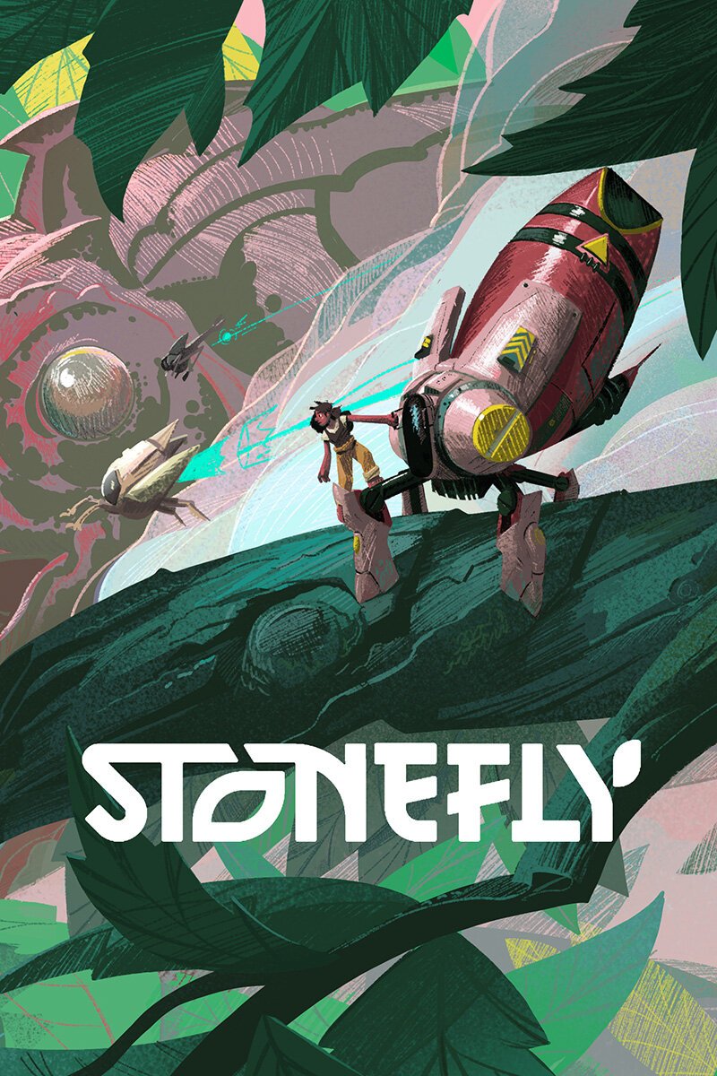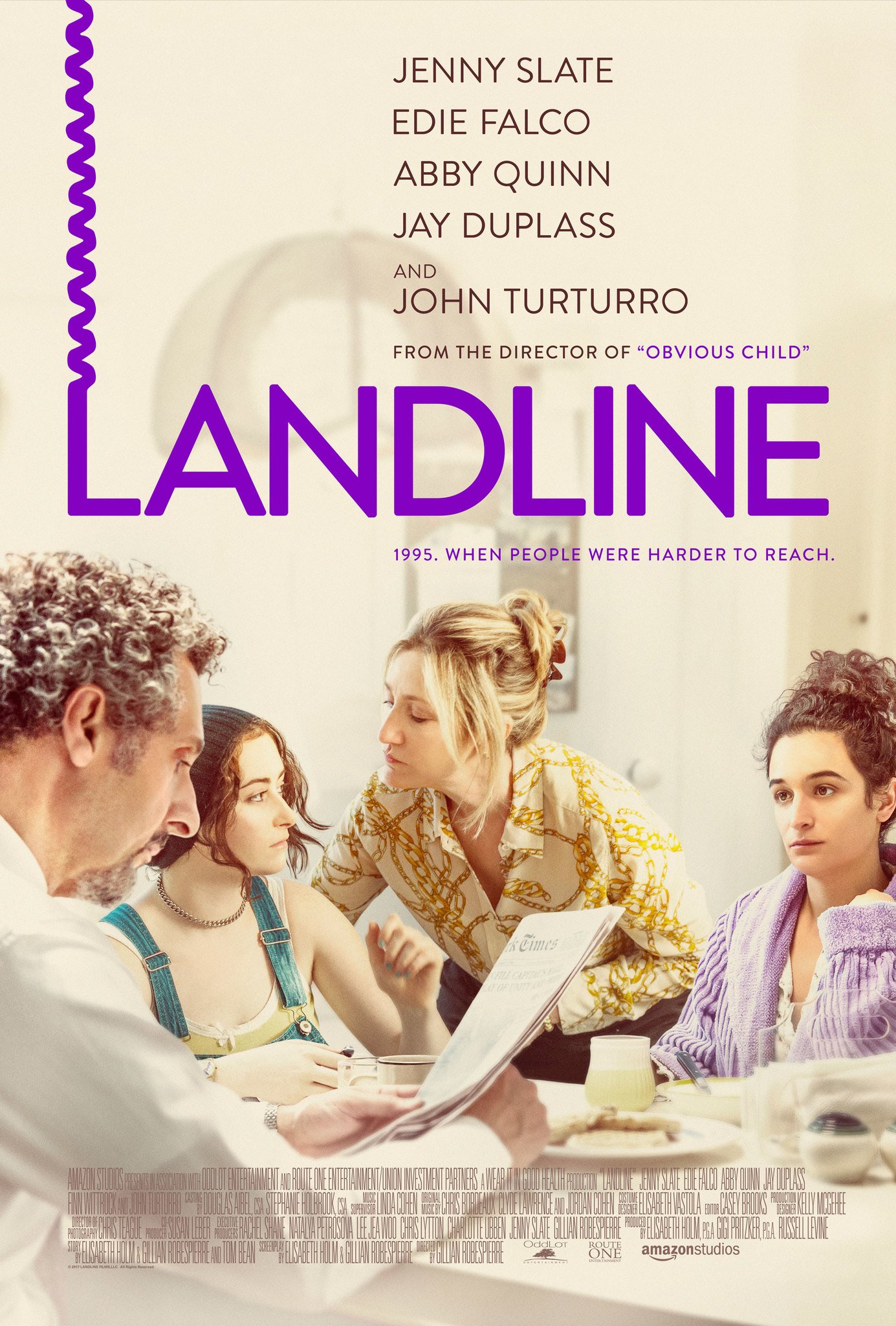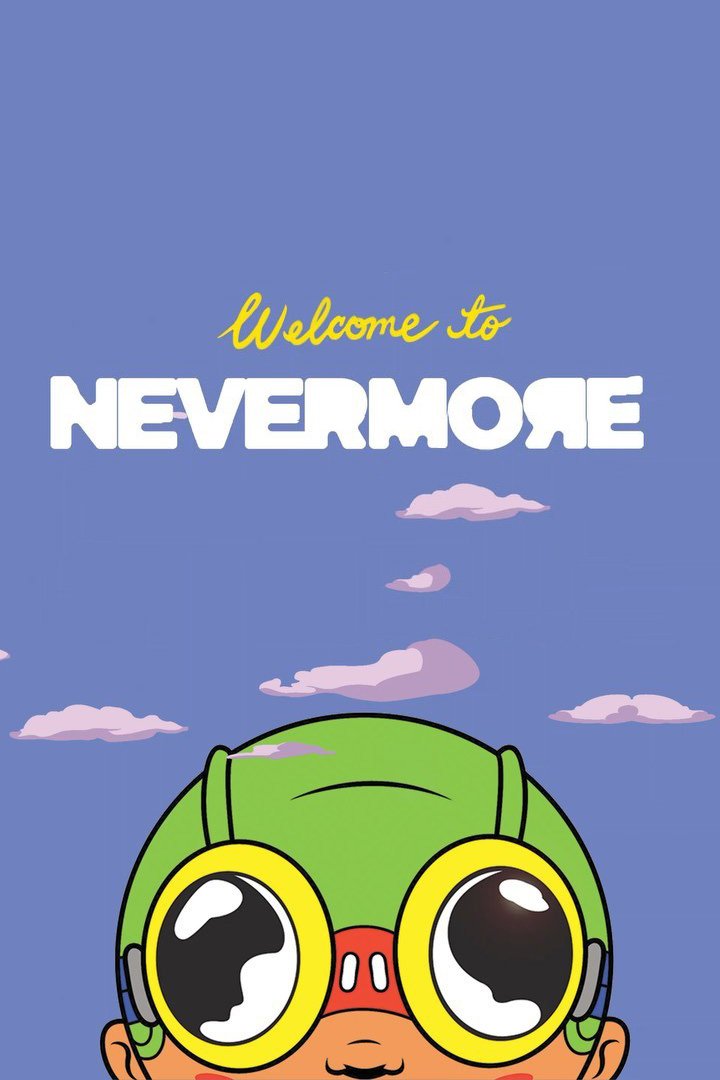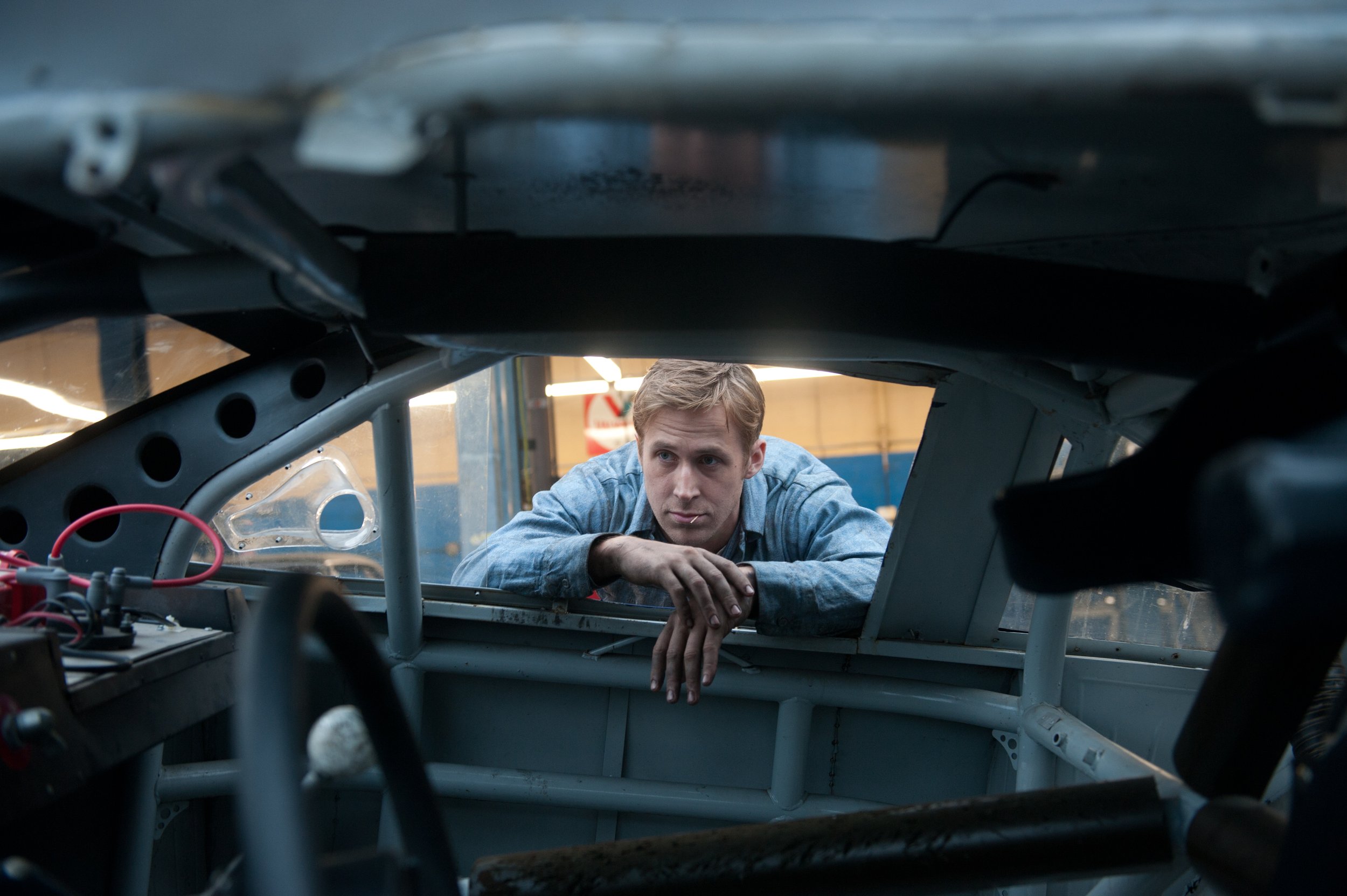
A website created for the award-winning company behind Drive, Motherless Brooklyn, & The Eyes of Tammy Faye.
Services
Built in collaboration with Madison Wells Media, twice named by Fast Company as a top-ten innovator.
Founded by award-winning producer Gigi Pritzker, the Madison Wells team develops, produces, and funds projects predominantly in the film, television and theatre space, while incubating content with partners who believe that good storytelling sparks important conversation.
We first joined the project in the middle of a redesign that had found itself stuck in a loop of endless conference calls and stagnant design; it was clear to the team at Madison Wells that they needed a much more integrated relationship with a new studio, one that could help build the kind of fluid, up-to-date site needed for its multi-division efforts.
Evolution of a team
Madison Wells is, above all, a forward-thinking studio that is constantly evolving and experimenting. A team of true risk-takers that had just rebranded (from its original name, OddLot Entertainment) and was looking to roll out an entirely new online presence.
Our initial challenge was quickly understanding the complexity of several distinct, cutting-edge studios that now existed under one roof and unified mission.
The challenge was unique in that this wasn’t a singular film studio with a dozen high-acclaim film projects to their name. This was a hybrid of broadway theater, immersive VR experiences and games, mixed media storytelling, and, of course, major film and TV projects.
Heavy lifting
After meeting face-to-face with each dept head, we got straight to work building a site that could quickly scale with the company. We were able to tackle the true scope of the company and roll out individual pages for every past, current, and future project.
Not only did we build a new site from the ground up, we also implemented a major rollout of new social media channels and edited a brand-new sizzle reel.
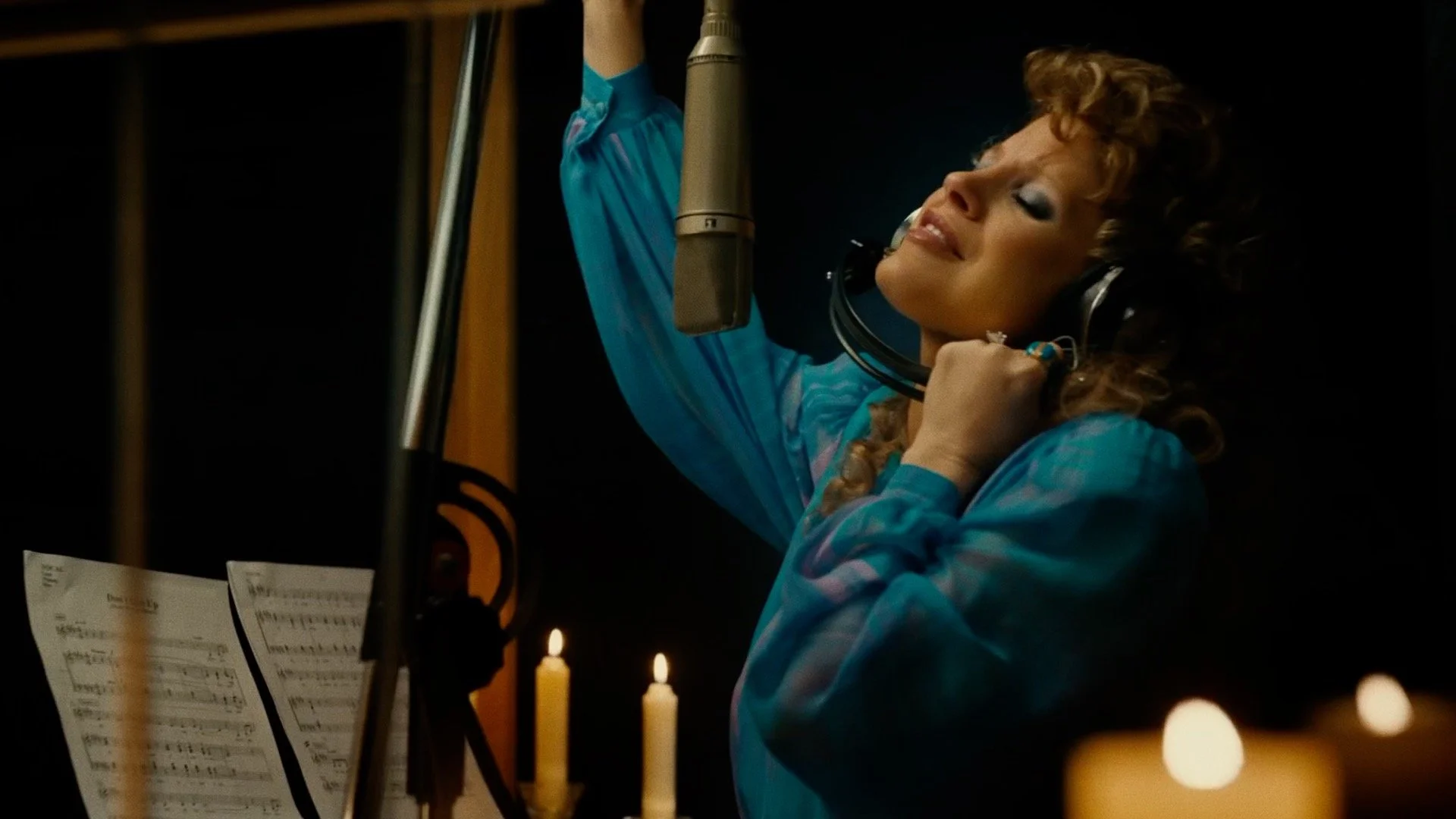
Thanks to our hands-on approach, we were intimately familiar with all existing media related to MWM, allowing us to quickly produce assets that could serve multiple purposes across web design, social outreach, and professional representation in media outlets.
One of the reasons we love working with media companies is letting the brilliant visuals speak for themselves. It was a major deep dive that coincided with industry-wide press announcements on the rebranding campaign.
Keeping Pace
One of the key reasons we work the way we do with companies is there is nothing set-it and forget-it about running a business. Things change. Sometimes, they change a lot and all at once.
The v.1 of the site we first built served the expanding team well during the first few years of our relationship; however, it was time for a change —
Coming out of Covid-19, the team was looking to reimagine its branding to better align with a new vision statement and a focus on women-led storytelling across the divisions of film and live entertainment.
This meant starting from scratch on a new website.
Something we are uniquely positioned to do because we’ve remained an integrated (yet remote) part of the team for multiple years. In other words, we know the voice and trajectory of the company in a very real and actionable way.
The v1 branding for MWM leaned into solid blacks and corporate blues.
The new v2 branding for MWM embraced a bold, complimentary color palette embraced bold.
We were able to hit the ground running with nothing more than an email from the team about upcoming changes.
When we say “hit the ground running,” we mean it. We didn’t even need to set aside time on a conference call before rapid prototyping a working concept of the site after getting a sneak peek at the branding doc.

SoKrispy Media - Daydreams Series
This speed and efficiency are not the norm.
Generally speaking, rumors of a company-wide rebranding effort immediately kick off a series of hour-long video meetings, approval requests for wireframes and visual assets, back-and-forth budget assessments, and on and on.
We work hard to avoid this pain point with companies.
Because we fully understood the structure and history of MWM, we knew how to build a brand new v.2 site and look that would best support the coming changes, project scope, and involved teams.


